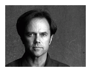
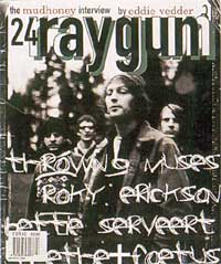
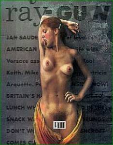
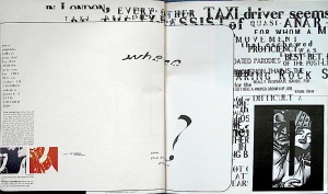
David Carson a typo guy is an American graphic designer, art director and a surfer. He is best known for his innovative magazine design, and use of experimental typography. He was the art director for the magazine Ray Gun, in which he employed much of the typographic and layout style for which he is known. In particular, his widely imitated aesthetic defined the so-called “grunge typography” era.
David Carson’s design is very much driven by his intuition. He claims that having an intuitive design sense is what it matters. He encourages designers to listen to their intuition and explore their uniqueness through their work. In the speech “David Carson: Design and Discovery”
About His Design (Photographic typography)
David Carson not only changed the look of youth oriented magazines, but he provided opportunities for talent new designers and illustrators to express their style.
Post-Modernism in the nineties evolved into a mannerism that reveled in the complex integration of type and image.
Inspired by Émigré, Fuse, and grunge, this hybrid called Controlled Chaos allowed for the assimilation of the most advanced technology to the least sophisticated vernacular.
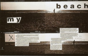
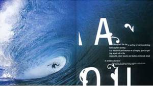
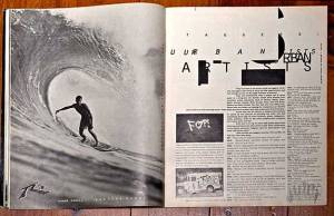
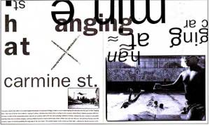
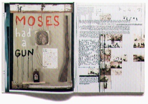
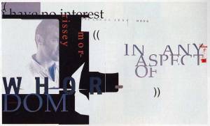
Carson went further than any of his generation in exploiting the Mac’s programmatic. He broke the rules of design in every way including negative leading, overlapping, layering,
and creating absurd compositional layouts, such as backwards text settings and columns of texts that bled off the page or aligned or overlapped each other.
Yet he still abides by the principles of design. (Focal point, eye flow, hierarchy etc.)Even using negative space to compliment the chaotic elements.
Ray Gun Magazine
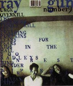
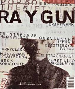
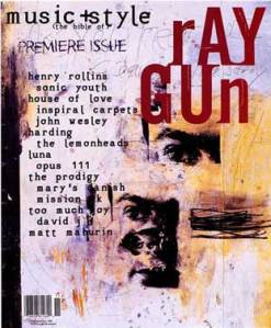
Ray Gun was an anti-glossy, anti-establishment manifesto that became a synonym of rock & roll,rebellion and alternative spirit.His do-it-yourself, colourful retro and collage inspired covers were a shock to everyone in the 90’ and Carson himself found them surprising.
Ray Gun was an alternative music magazine, so instead of designing by a grid or with any specific structure, Carson created spreads based on how the music spoke to him.
Carson constantly stresses,
“Don’t mistake legibility for communication.”
In a documentary on Helvetica, Carson criticizes the lack of expression
in certain words written in Helvetica, such as “caffeinated,” and “explosion,”
because of their bland appearance. He said,
“There’s a very fine line between simple and clean and powerful,
and simple and clean and boring.”
